Speculative Design was a project that encouraged me to explore editorial design while diving deep into research around a speculative concept.
The biggest challenge was designing a wide variety of type-based layouts that kept the book visually engaging while maintaining a cohesive structure throughout.
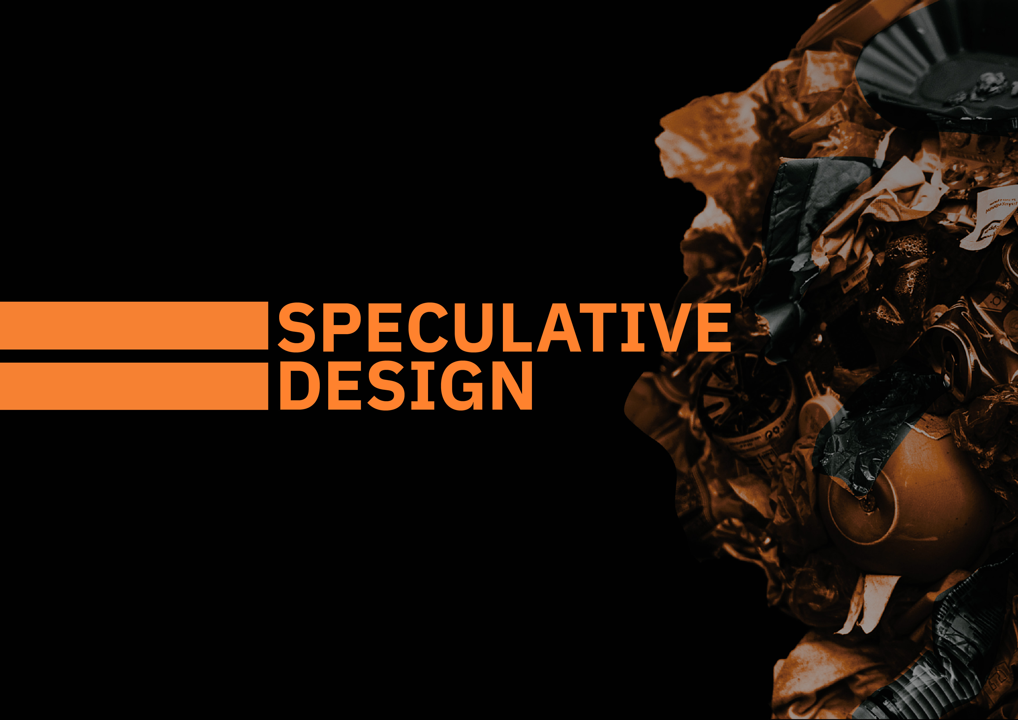
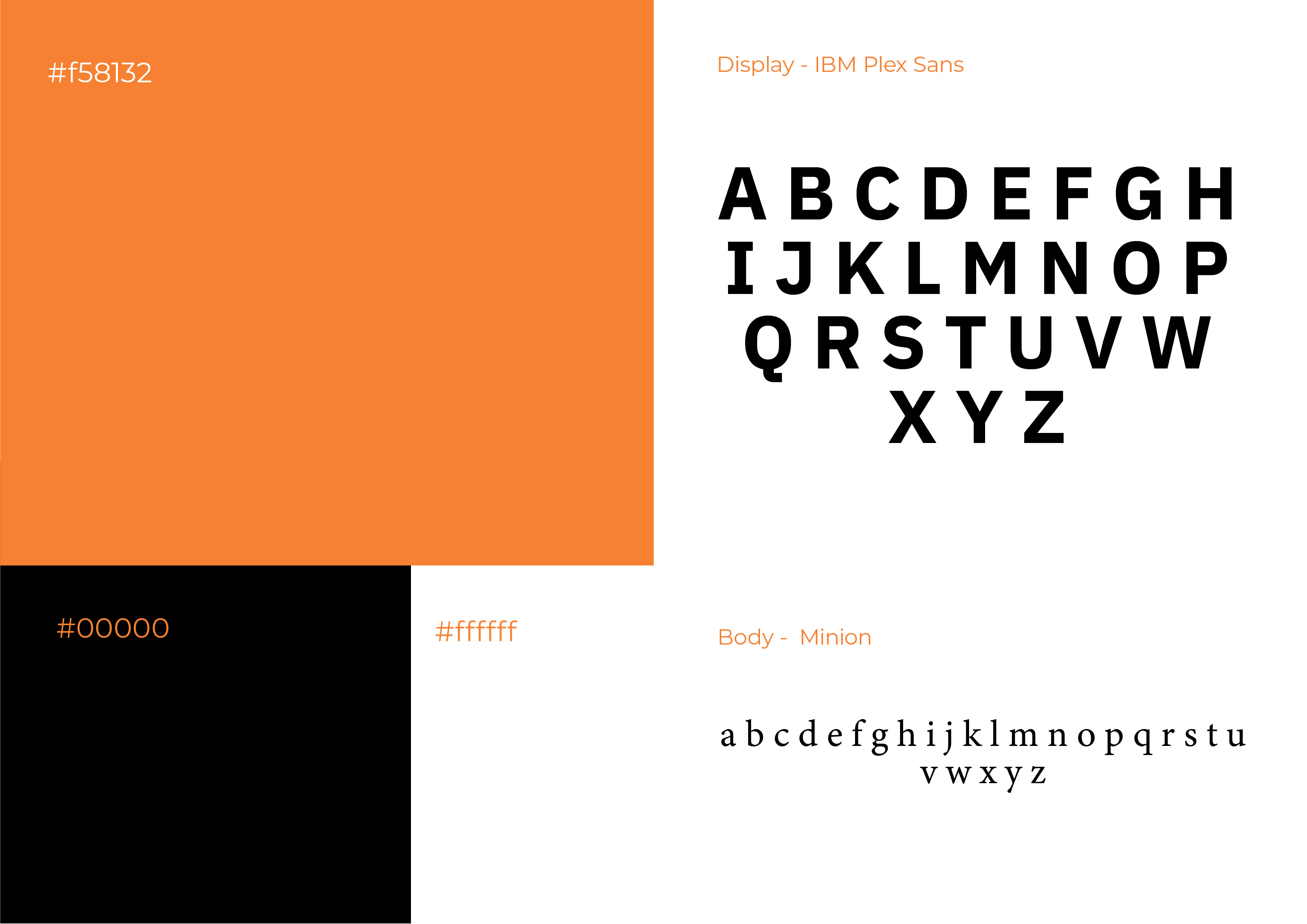
The book features a monochromatic palette with orange as the sole accent colour. I chose orange for its duality — it feels warm, yet carries a sense of urgency and threat. Historically, it's also associated with caution and warning, aligning with the book’s tone.
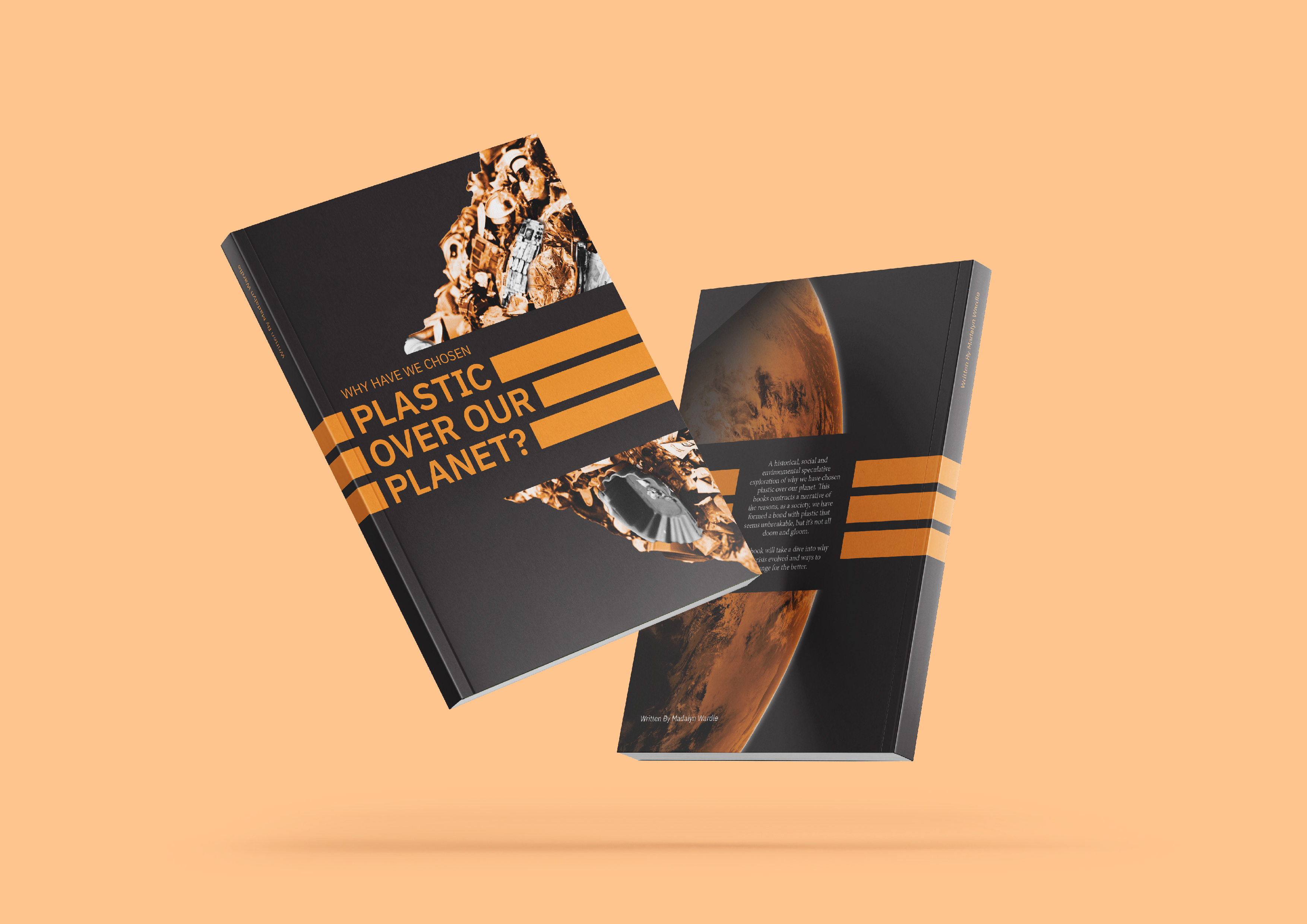
The finished piece is a physical book of over 100 pages, documenting both my design process and the extensive historical research behind the concept.